Inception film poster analysis:
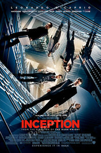
The Mise-en-scene is the city Tokyo covered with water with a very dark and stormy setting, also the mise-en-scene is used in the last scene where they find Leonardo DiCaprio in limbo.
By advertising that Leonardo DiCaprio who is the a-list actor is featured in this film which displays use of the Gledhill’s theory that will draw in a fan base of movie fanatics that are connected to Leonardo into watching the film.
This demonstrates that the film is of high quality since an a-list movie actor would choose a more extravagant well-funded movies then a less funded movie.
The colour scheme is very dark, blues and navy blue has been used to show how surreal and dream like the film is.
The poster also has hints of red, the red title is used to make it stand out and very effective. This suggests an element of reality and dreams is used in the tag-line to create mystery for the audience. ‘Your mind is the scene of the crime’ , the language on this is very clever as it gives us an insight to the film and what is going to happen.
Furthermore the costume of the dark suit shows how intense the film is, the suit shows how business orientated the character in the film is.
Also, the title does not stand out on the page as it is cracked and the font makes it quite hard to read. The blue interlinks with the dreams in the film, blue usually links with a dreams/fantasy type film.
There isn’t much text on the film poster, however there is a small bit of text. The film title draws attention with the enlarged text and bold font with bright red draw to create mystic. The colour red is commonly used for film posters in the thriller/horror genre.
Blow up film poster analysis:
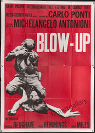
The poster for “Blow Up” is designed to look like a screen print. The image of the model and photographer is a mid-shoot which is enlarged to the limits of half-tone photomechanical reproduction.
Peering at the images it’s a bravura bit showing the existential power of images and the mind’s propensity to construct tales from them. This is illustrating a sense of urgent and dynamic reality to both the protagonists and to the film event.
The visible half-tone effect also positions the image amongst those associated with documentary and press photographs. So, the poster image immediately appeals to the heightened realism associated with the thriller genre.
Three versions of the poster exist, each with different colored backgrounds.
The solid red, yellow and green provide for variation when the poster is displayed, in series, on the hoardings of building sites and street corners.
By using a visual rhetoric of functionalism and a graphic style derived from the exigencies of counter-cultural fly posting, the poster brings together the film space and street scene of cosmopolitan London.
The titles and credits are presented in a typographic style associated with the workaday functionalism of 1960s modernism.
The text eschews all decoration in favour of emotional neutrality that, again, positions the film within the domain of non-fiction.
